A normal bell curve made with humans

A group of students are stacked according to their heights. The result resembles a normal bell curve.

Figure 1 – Normal Bell Curve of Heights of Students (found here)

Who are the students in the picture? The image is from the statistics and actuarial science department of Simon Fraser University. These students are likely from this university (either from the statistics department or from other areas). Beyond the assumption of being students in a Canadian university, we do not know much else about the students.

There are 46 students in the picture. All students with the same height stand in the same column with the first student in a column holding a sign stating the height. The signs are in ascending order from left to right. This formation of the students according to heights resembles a normal bell curve. Most of the students cluster in the middle with very few students at either the left tail (short students) or the right tail (tall students). This is a clever demonstration of the normal bell curve. It is relatively easy to create – basically ranking the students according to heights. It is an excellent opportunity to discuss the properties of normal bell curve.

Interestingly male and female students are mixed together. It appears that female students are mostly standing to the left of the center and male students on the right. The discussion would be even more meaningful if the students are grouped by gender (in two separate photos). In any case, we work with the photo as is. The following is the same stacking of the students with the students represented by dots.

Figure 2 – stacking of dots to represent the same bell curve

Figure 2 (a dot plot) actually gives a lot more clarity on the shape of the curve. The curve is not perfectly symmetric, though the overall shape resembles a bell curve. The curve is not “smooth” as there is depression in some places (e.g. at 5′ 3″, 5′ 5″ and 5′ 10″). Perhaps the “rough” curve is due to the mixing of two populations (males and females) or perhaps due to the small sample size. The curve appears sufficiently close to a normal bell curve to warrant a closer look.

The dot plot in Figure 2 actually gives the sample data. Let’s perform calculations on the sample data. Particularly we focus on calculations that can confirm whether the curve is a normal bell curve (at least whether we should reject the notion that it is a normal bell curve). If there is reason to believe that the heights of university students are normally distributed (or approximately normally distributed), the normal model can be useful for making estimations. We give a few examples to demonstrate how this is done.

First, calculate the mean and the median of the height measurements. The mean is 66.78 inches and the median is 67 inches. The mean is simply the sum of all the measurements divided by the total number of data points. The median is the measurement that is in the middle if the measurements are ranked in ascending order, which is the case in Figure 2. The mean and median are very close – indication that the height measurements form a symmetric distribution.

Another check is to see whether the height measurements follow the empirical rule (also known as the 68-95-99.7 rule). Here’s the rule.

  • About 68% of the data will fall within plus or minus one standard deviation of the mean.
  • About 95% of the data will fall within plus or minus two standard deviations of the mean.
  • About 99.7% of the data will fall within plus or minus three standard deviations of the mean.

To verify these three points, we need to calculation the standard deviation of the height sample data. The sample standard deviation of height measurements is 3.37 inches. Here’s the three intervals of interest.

  • (66.78 – 1 x 3.37, 66.78 + 1 x 3.37)=(63.41, 70.15)
  • (66.78 – 2 x 3.37, 66.78 + 2 x 3.37)=(60.04, 73.52)
  • (66.78 – 3 x 3.37, 66.78 + 3 x 3.37)=(56.67, 76.89)

The question is, how many of the 46 height measurements fall into each interval? For example, how many of the measurements are between 63.41 and 70.15 inches? Is the percentage close to 68? Here’s the counts.

  • 30 measurements in (63.41, 70.15). Percentage = 30/46 = 65.2%
  • 45 measurements in (60.04, 73.52). Percentage = 45/46 = 97.8%
  • 46 measurements in (56.67, 76.89). Percentage = 46/46 = 100%

These percentages are off from the 68-95-99.7 rule, but are close enough. Of course, the percentages from the data do not have to match the 68-95-99.7 rule exactly in order to conclude that the distribution is normal. Because the actual percentages of 65-.2-97.8-100 are close enough, there is no reason to believe that the height measurements of university students is not a normal bell curve.

Once we know that the height measurements of people in a certain population (university students in this case) shape like a normal bell curve, we can use the bell curve to estimate proportion of the population that fall into a given interval. This is one advantage of working with a normal distribution.

Based on the above discussion, we conclude that the height measurements of university students follow an approximate normal distribution with mean 66.78 inches and standard deviation 3.37 inches. With this information, we can make estimation.

For example, what is the proportion (or percentage) of university students whose heights are less than or equal to 70 inches?

The key to answering the question is to convert the height measurement of 70 inches into a standardized score (or z-score), which in this case is 0.96. The z-score is obtained by this calculation: z=(70 – 66.78)/3.37 = 0.96 (rounded to two decimal points). Then we can look up the z-score 0.96 in a normal table to obtain the probability 0.8315. We conclude that about 83.15% of university students are 70 inches or shorter. To look up 0.8315, use a normal table that is similar to the one found here. Looking up normal probability using a calculator will yield slightly different answer.

Another example. What is the probability that a randomly selected university student is between 64 inches (5 feet 4 inches) and 70 inches (5 feet 10 inches) tall?

First, turn the measurements of 64 inches and 70 inches into standardized scores (z-scores). The z-score of 70 inches is 0.96 (as calculated above). The z-score of 64 inches is (64 – 66.78)/3.37 = -0.82 (rounded to two decimal places). The probability of the z-score of -0.82 is 1 – 0.7939 = 0.2061. Note that the table in the link has no negative z-scores. So look up the z-score of 0.82, which gives 0.7939. Then subtract 0.7939 into 1 gives 0.2061. Then the answer to the question is 0.8315 – 0.2061 = 0.6254. This tells us that about 62.54% of the time, a randomly selected university student is between 64 and 70 inches tall.

One more example, what is the proportion of university students taller than 6 feet (72 inches)?

The z-score of 72 inches is (72 – 66.78)/3.37 = 1.55. Looking up the table, the probability is 0.9394. This would be the probability of less than 70 inches. So the answer is 1 – 0.9394 = 0.0606. About 6% of the university students is 6 feet tall or taller. If the size of the student body is 10,000, then there are about 600 students who are 6 feet or taller.

Here’s a few previous posts on normal distribution.

Comments about Calculation

To calculate the mean and median as well as standard deviation of the height measurements, we should use a statistical calculator (or software) if possible. If the goal is to compute using basic principle, the mean is of course the sum of the data points divided by the total number of data points. In this example, sum all the 46 height measurements and then divide the sum by 46.

To find the median height measurement, rank the measurements from smallest to the largest. The measurements shown in Figure 2 are already ranked. Locate the 23rd measurement and the 24th measurement. The median would be the average of these two measurements. Since they are the same (67 inches), the median height measurement is 67 inches.

To find the standard deviation of the height measurements, use a calculator with statistical functions. To calculate without using a statistical calculator, first calculate the sample variance. Then take square root of the sample variance. The following is how the variance is calculated (this is best done in a spreadsheet or other software).

    \displaystyle \begin{aligned} s^2&=\frac{1}{46-1} \biggl((60-66.78)^2+(61-66.78)^2 \\&\ \ + (62-66.78)^2+\cdots+(72-66.78)^2+(73-66.78)^2+(73-66.78)^2 \biggr) \\&=\frac{1}{45} \times 511.8264 \\&=11.37392 \end{aligned}

The idea is to take the difference between each measurement and the mean 66.78 and then square the difference. Do this for each of the 46 measurements. Sum these 46 squared difference. Then divide the sum by 45 (one less than 46). This adjustment of dividing by one less than the sample size is to sample variance an unbiased estimator of the population variance.

The sample standard deviation is the square root of 11.3792. Thus the standard deviation of the height measurements is \sqrt{11.3792}=3.372524277 inches.

\text{ }

\text{ }

\text{ }

\copyright 2017 Dan Ma

Posted in Exploratory Data Analysis (EDA), Normal Distributions | Tagged , , , , , | 1 Comment

Making sense of Powerball data

Collecting data on the Powerball lottery depends on one’s perspective. Of course, for anyone who purchased a ticket, the first set of data points would be the winning numbers – checking to see if the numbers on the ticket match the winning numbers. If there is a partial match or complete match, the next important thing to know would be the amounts of winning. For those of us who have no skin in the (Powerball) game, looking at data would be for the purpose of trying to answer broader questions about Powerball or lottery in general. This post looks at Powerball jackpot payout data to answer questions.

For example, how often does someone win the Powerball jackpot? Every drawing (occurring twice a week) produces winners for the smaller prizes, but does not always produce winner(s) of the jackpot prize (the grand prize). If jackpot winners emerge, what would be the typical size of the “won jackpot”? After we take a look at the data, a clear pattern emerges. We will comment on the pattern that we see.

Powerball data are readily available. Historical Powerball winning numbers are published going far back. But the just knowing the winning numbers tell us nothing. The winning numbers alone do not tell us whether jackpot winners were produced in that drawing. The organization that runs Powerball make data for the smaller prizes readily available. However, the huge jackpot prizes are what captivate the public. It is natural that people would want to know how often the jackpot prizes are won, and how big the payouts are typically. However such data are not readily available.

Luckily a website keeps track of all the Powerball jackpot payouts from 2003 to August 26, 2017 (here’s the link and here’s the PDF file). The web page in the link lists out the draw date, the amount of the won jackpot, the names of winners and their state. The PDF file only has the draw date and the winning amounts.

There are 175 won Powerball jackpots in this 14-year period from 2003 to August 2017, giving an average of 12.5 won jackpots per year. Of course, that is not the end of the story. It is also helpful to look at data from two perspectives – looking at the data graphically and using numerical measures.

First let’s group the winnings by year.

Figure 1 – Frequency of Powerball Jackpot Winnings

There are 11 Powerball jackpot winnings in 2003 and also 11 in 2004. The frequency fluctuates quite a bit. The counts range from 11 to 16 during the period from 2003 to 2015. There are only 7 Powerball jackpot winnings in 2016 and 5 in 2017. The year 2017 is a partial year. So let’s focus on 2016. Why are there fewer grand prize winners in 2006? Let’s look at the total payouts in each year.

Figure 2 – Powerball Jackpot Total Payout By Year (not including non-jackpot prizes)

For example, the 11 won jackpots in 2003 add up to $1,139 million ($1.139 billion). The total payouts in 2004 are slightly less but still in the $1 billion range. The annual total payouts increase steadily over the years but more dramatically in recent years. Notice the big spike in 2016. The Powerball jackpot payouts in 2014 and 2015 are around $1.8 billion. The payouts in 2016 are $3,431 million or $3.4 billion, essentially doubled from 2015.

The amount of jackpot winnings is an indication of ticket sales. So 2016 was a banner year for Powerball (for the people running Powerball). Sales were up, revenue were up. The next graph shows the average payout per jackpot by year.

Figure 3 – Powerball Jackpot Average Payout By Year (not including non-jackpot prizes)

The average payout is calculated by summing all the payouts in a given year and divided by the number of payouts in that year. Once again 2016 has a huge spike. Prior to 2016, the average jackpot payout is in the $100 million range. In 2016, the average Powerball payout per jackpot is $490 million (just $10 million shy of half a billion dollars). For the 12 winnings in 2016 and 2017, the average jackpot winning is about $440 million while the average jackpot winning prior to 2016 is about $128 million. The average in 2016 and 2017 is 3.4 times higher the average in the prior years.

The largest jackpot winning in Powerball’s history occurred in January 2016 and it is a whopping $1.58 billion! That one jackpot alone would be greater than the total payouts for some of the prior years!

It is clear from the graphics and the calculation that there are now fewer Powerball jackpot winners. So it is getting harder to win the Powerball jackpots. The winning jackpot sizes are dramatically getting bigger. This phenomenon has been occurring since the end of 2015. This is no coincidence though. The bigger payouts and the more difficult odds are in fact manufactured.

In October 2015, a new set of Powerball rules went into effect that make it much harder to win the jackpot but easier to win the smaller prizes. As a result, the jackpot keeps building until it reaches the hundreds of million dollars range (or even the billion dollar range). The folks that redesign the rules understood that excitement drives ticket sales. In a sense the public is manipulated and the frenzy around the huge jackpot is manufactured. When the jackpot reaches half a billion dollars, some people who normally would not play Powerball would buy one ticket (or multiple tickets) just to join the excitement.

The most recent Powerball jackpot win is on August 23, 2017. The total jackpot is $758.7 million. The excitement would begin to build as the jackpot rises to several hundred million dollars. As the excitement grew in the course of several months (the jackpot winning prior to August 23 is on June 10, 2017), the increased volume of ticket sales would make it more and more likely that a jackpot winner would emerge.

There are over 292 million different 6-number Powerball combinations. For a winner to emerge, there must be enough people who purchase a large portion of these 292 million combinations. For that to happen, there must be sufficient excitement to drive ticket sales. To understand this dynamics, it is helpful to understand why the odds of winning the Powerball jackpot are 1 in 292 million (see here for the calculation).

It seems that Powerball is a great business model for the people who run it. Is it a great business model for the Powerball players? Should they invest their money elsewhere? This point is discussed in a piece in a companion blog. Another piece discusses Poweball and the lottery curse.

\text{ }

\text{ }

\text{ }

\copyright 2017 Dan Ma

Posted in Descriptive statistics, Games of chance | Tagged , , | 1 Comment

Food scientists need to make sense of numbers

Food – the part of the economy that encompasses the production, the processing and the marketing of foods – is big business. In fact, the successes of the food industry depend in no small measure on the use of statistics. For example, the scientists in a food company need to understand and measure the sensory quality of foods. They want you to spend more and eat more. One of the ways to do that is to produce the food products that tickle and entice as many of the senses as possible.

Two short courses (one-day and two-day) offered by the Food Science Department at Rutgers University give some clues on the statistics used in food science. Here’s the link to the short courses (statistics and sensory evaluation). Just in case the links are broken or removed in the future, here’s the screen shots for the course descriptions.

Course: Statistics for Food Science

The above screen shot is the description of a statistics course called Statistics for Food Science. The topics are basic statistics topics that are applicable in many disciplines and industries. It is clear that the course will be tailored to the food industry. The broad goal of the course is to help scientists and specialists in the food industry to properly design and carry out experiments and to make sense of the data produced in the experiments and other studies.

There are 7 bullet points for the subjects/topics discussed in the course. All of them are useful topics. In fact, some of these topics are even touched on in some level in an introductory stats course. For example, the first bullet point is on descriptive statistics – using numerical measures and graphical summaries to make sense of data. An introductory course touches on regression and sampling distribution theory (at least superficially). For example, simple regression (one explanatory variable and one response variable) and one-variable sampling theory involving normal distribution are covered in an introductory stats course. Basic concepts in experimental design are covered too in an introductory course.

So all the topics listed are important and useful. But it is not clear how they can covered these many topics in a meaningful way in one day (the course goes from 8:30 AM to 4:30 PM). But clearly, these statistical concepts are useful for the food industry. Presumably the fees for the attendees are paid for by their employers. In any case, this short course demonstrates the importance of statistics in the food industry. More importantly, it demonstrate to anyone taking an introductory stats course that what they are learning in class can open up a world of new ideas and opportunities.

Here’s the description of the course on sensory evaluation.

Course: Sensory Evaluation

This course is a hands-on course. The goal is to develop a greater understanding of the science behind food aroma, taste, color and texture, in other words, ways to make food products more enticing and appealing. The 4 bullets points list out the key objectives – learning about different tests that can be used and developing practical skills on setting up and running discrimination tests. Descriptive statistics (third bullet) is a bog topic – analyzing the data that are produced from the tests and experiments.

We are not endorsing the courses by any means. These courses provide a vivid example of applications in statistics, in this instance in food science. This post is a plug on statistics and not necessarily a plug on the entity that gives the courses.

______________________________________________________________
\copyright 2017 – Dan Ma

Posted in Commentary, Statistics In Action | Tagged , , | Leave a comment

The probability of breaking the bank

What is the likelihood of a gambler winning all the cash in a casino? A better question is: what is the likelihood of a gambler losing all the money he or she brings into the casino?

There had been casinos going out of business for sure. But those bankruptcies were the results of business failures, e.g. not attracting enough customers to come into the casino, and were not for the results of gamblers breaking the bank. The business model of the casino is based on a built-in advantage called the house edge, which in mathematical term is the the casino’s average profit from a player’s bet. The house edge differs for different games but is always positive (e.g. the house edge for the game of roulette is 5.26%).

As long as a casino has a steady stream of customers willing to plunk down cash to play various gambling games, the casino will always win. For example, for every $100 bet in the game of roulette, the house wins on average $5.26. This post discusses a problem called gambler’s ruin that will further highlight a gambler’s dim prospect against the house.

The problem of gambler’s ruin features two players A and B, betting on the outcome of a coin. At the start of the game, there are n 
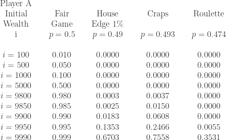
units of wealth between the two players, with player A owning i units and player B owning n-i units. In each play of the game, a coin is tossed. If the result of the coin toss is a head, player A collect 1 unit from player B. If the result of the coin toss is a tail, player A pays player B 1 unit. What is the probability that player A ends up with all the n units of wealth? What is the probability that player B ends up with all the n units of wealth? Probability of winning is winning for one player is the probability of losing for the other player. The following further clarifies the probabilities being discussed.

If the total wealth n is a large number and player A owns a small proportion of that, then player A is like the gambler and player B is like the house. Then the the probability of player A owning all n units of initial wealth is the probability of player A breaking the bank and the probability of player B owning all n units of wealth is the probability of ruin for player A.

In playing this game, player A gains 1 unit for each coin toss that results in a head and loses 1 unit for each coin toss that results in a tail. Theoretically player A can go broke (losing all the i units that he starts with) or break the bank (owning the total n units between the two players). Losing it all for player A is certainly plausible especially if there is a long run of tails in the coin tosses. On the other hand, winning everything is plausible for player A too, especially if there is a long run of heads. Which is more likely?

The answer to the problem of gambler’s ruin will produce two formulas that can tell us the likelihood of player A winning, and the probability of player A losing everything.

______________________________________________________________

Gambler’s Ruin

The answers had been worked out in a recent post in a companion blog on probability. In this post, we discuss the answers and make some remarks on gambling. We first discuss the case for even odds and then the general case.

Even Odds. Suppose that player A and player B bet on tosses of a fair coin. Suppose further that player A owns i units of wealth and player B owns n-i units at the beginning. The long run probability of player A winning all the units is \displaystyle A_i=\frac{i}{n}. The long run probability of player B winning all the units is \displaystyle B_i=\frac{n-i}{n}.

The probability of a player owning all the original combined wealth is the ratio of the initial wealth of that player to the total initial wealth. Putting it in another way, the probability of ruin for a player is the ratio of the initial wealth of the other player to the total initial wealth. For the player with only a tiny percentage of the combined wealth, the probability of ruin is virtually certain. For example, if the house (player B) has 10,000,000 units and you the gambler (player A) has 100 units, then the probability of ruin for you is 0.99999 (99.999% chance). This is based on the assumption that all bets are at even odds, which is not a realistic scenario when playing against the house. So in the uneven odds case, the losing probabilities for the gambler would be worse.

Uneven Odds. Suppose that player A and player B bet on tosses of a coin such that the probability of tossing a head is p with p not 0.5. Let q=1-p. Suppose further that player A owns i units of wealth and player B owns n-i units at the beginning. The long run probability of player A winning all the units is \displaystyle A_i=\frac{1-\biggl(\displaystyle \frac{q}{p} \biggr)^i}{\displaystyle 1-\biggl(\frac{q}{p} \biggr)^n}. The long run probability of player B winning all the units is \displaystyle B_i=\frac{1-\biggl(\displaystyle \frac{p}{q} \biggr)^{n-i}}{\displaystyle 1-\biggl(\frac{p}{q} \biggr)^n}.

First, let’s unpack these formulas. Let’s say the coin has a slight bias with the probability of a head being 0.49. Then p = 0.49 (the house edge is 1%) and q = 0.51 with \frac{q}{p}=\frac{0.51}{0.49} = 1.040816327. Let’s say the total initial wealth is 100 units and player A owns 10 units at the beginning. Then A_{10} is the following:

    \displaystyle A_{10}=\frac{1-\biggl(\displaystyle \frac{0.51}{0.49} \biggr)^{10}}{1-\biggl(\displaystyle \frac{0.51}{0.49} \biggr)^{100}}=0.00917265

In the even odds case, player A would have a 10% chance of winning everything (by owning 10% of the total initial wealth). With the house having just a 1% edge, the chance for winning everything is now 0.917%, less than 1% chance!

To calculate the probability of player B winning everything, plug into the ratio \frac{p}{q} instead of \frac{q}{p}. In the numerator, \frac{p}{q} is raised to n-i. In other words, \frac{p}{q} in the numerator is always raised to the initial wealth of the player being calculated. In the example of p = 0.49, plug in \frac{p}{q}=\frac{0.49}{0.51} to obtain B_{10} = 0.99082735. There is more than 99% chance that player B (the house) will own all 100 units.

Note that A_{10}+B_{10} equals 1.0. In fact, A_{i}+B_i is always 1.0. Thus B_{i} can be calculated by 1-A_{i}. In other words, the probability of breaking the bank plus the probability of ruin is always 1.0. When a gambler plays at a casino, there are only two possibilities, either breaking the bank or ruin. There is no third possibility, e.g. the game goes indefinitely with no winner.

______________________________________________________________

More Calculations

Using Excel, the winning probabilities for player A are calculated for two scenarios, one for total wealth of 100 units and one for total wealth of 10,000 units. The results are in Table 1 and Table 2. Each table uses four values of p, starting with the fair game of p = 0.5. The column for p = 0.49 does not correspond to an actual casino game. It is used to demonstrate what happen when the house has a 1% edge. The last two columns are for the game of craps and the game of roulette.

    Table 1 – Probabilities of Player A Breaking the Bank
    Total Initial Wealth = 100 Units

    \begin{array}{ccccccccc}  \text{Player A} &  \text{ } & \text{ } &  \text{ } & \text{ }  & \text{ } & \text{ } & \text{ } & \text{ } \\    \text{Initial} &  \text{ } & \text{Fair} &  \text{ } & \text{House}  & \text{ } & \text{Craps} & \text{ } & \text{Roulette} \\  \text{Wealth} &  \text{ } & \text{Game} &  \text{ } & \text{Edge 1\%}  & \text{ } & \text{ } & \text{ } & \text{ } \\  \text{i} &  \text{ } & p=0.5 &  \text{ } & p=0.49  & \text{ } & p=0.493 & \text{ } & p=0.474 \\    \text{ } &   \text{ } & \text{ } & \text{ } & \text{ } &  \\   i=10 &   \text{ }& 0.10 &   \text{ } & 0.0092 & \text{ } & 0.0209  & \text{ } & 0.0001 \\   i=20 &   \text{ }& 0.20 &   \text{ } & 0.0229 & \text{ } & 0.0486  & \text{ } & 0.0002 \\   i=30 &   \text{ }& 0.30 &   \text{ } & 0.0433 & \text{ } & 0.0852  & \text{ } & 0.0007  \\  i=40 &   \text{ }& 0.40 &   \text{ } & 0.0737 & \text{ } & 0.1337  & \text{ } & 0.0019  \\  i=50 &   \text{ }& 0.50 &   \text{ } & 0.1192 & \text{ } & 0.1978  & \text{ } & 0.0055  \\   i=60 &   \text{ }& 0.60 &   \text{ } & 0.1870 & \text{ } & 0.2826  & \text{ } & 0.0155  \\   i=70 &   \text{ }& 0.70 &   \text{ } & 0.2881 & \text{ } & 0.3949  & \text{ } & 0.0440 \\  i=80 &     \text{ }& 0.80 &   \text{ } & 0.4390 & \text{ } & 0.5434  & \text{ } & 0.1247 \\  i=90 &     \text{ }& 0.90 &   \text{ } & 0.6641 & \text{ } & 0.7400  & \text{ } & 0.3531 \\    \end{array}

    Table 2 – Probabilities of Player A Breaking the Bank
    Total Initial Wealth = 10,000 Units

    \begin{array}{ccccccccc}  \text{Player A} &  \text{ } & \text{ } &  \text{ } & \text{ }  & \text{ } & \text{ } & \text{ } & \text{ } \\    \text{Initial} &  \text{ } & \text{Fair} &  \text{ } & \text{House}  & \text{ } & \text{Craps} & \text{ } & \text{Roulette} \\  \text{Wealth} &  \text{ } & \text{Game} &  \text{ } & \text{Edge 1\%}  & \text{ } & \text{ } & \text{ } & \text{ } \\  \text{i} &  \text{ } & p=0.5 &  \text{ } & p=0.49  & \text{ } & p=0.493 & \text{ } & p=0.474 \\    \text{ } &   \text{ } & \text{ } & \text{ } & \text{ } &  \\   i=100 &   \text{ }& 0.010 &   \text{ } & 0.0000 & \text{ } & 0.0000  & \text{ } & 0.0000 \\   i=500 &   \text{ }& 0.050 &   \text{ } & 0.0000 & \text{ } & 0.0000  & \text{ } & 0.0000 \\   i=1000 &   \text{ }& 0.100 &   \text{ } & 0.0000 & \text{ } & 0.0000  & \text{ } & 0.0000  \\  i=5000 &   \text{ }& 0.500 &   \text{ } & 0.0000 & \text{ } & 0.0000  & \text{ } & 0.0000  \\  i=9800 &   \text{ }& 0.980 &   \text{ } & 0.0003 & \text{ } & 0.0037  & \text{ } & 0.0000  \\   i=9850 &   \text{ }& 0.985 &   \text{ } & 0.0025 & \text{ } & 0.0150  & \text{ } & 0.0000  \\   i=9900 &   \text{ }& 0.990 &   \text{ } & 0.0183 & \text{ } & 0.0608  & \text{ } & 0.0000 \\  i=9950 &     \text{ }& 0.995 &   \text{ } & 0.1353 & \text{ } & 0.2466  & \text{ } & 0.0055 \\  i=9990 &     \text{ }& 0.999 &   \text{ } & 0.6703 & \text{ } & 0.7558  & \text{ } & 0.3531 \\    \end{array}

Table 1 describes the gambling situations where the two players have a combined initial wealth of 100 units. It is not a realistic scenario for the situation of gambler vs. house as the total wealth is quite moderate. Perhaps it best describes the interpersonal gambling situations where the initial wealth positions of the two players are moderate in size. It is clear that the values of p are critical to the eventual success or ruin for player A. Let’s look at the row for i = 50 (both players in equal initial position). For a fair game, there is equal chance for breaking the bank and ruin. As the game becomes more unfair, the chance for breaking the bank is less than 1% (roulette).

In Table 1, the same pattern for i = 50 appears for the other initial positions as well. As p drops below 0.5 (as the game becomes more unfair to player A), the less likely it is for player A to win and the more likely it is for player B (the player who has the edge) to win.

Table 2, with the total wealth of 10,000 units, is designed to more realistically reflect the gambling situation of a typical gambler versus the house. With the higher combined wealth, the effect of p is more pronounced. For example, in the top half of Table 2, there is virtually no chance for player A to win at any of the unfair games, i.e. there is a virtually certain chance for ruin for the gambler. Even when player A has the same initial wealth as the casino, there is still no chance to win at the unfair games.

The bottom half of Table 2 shows that when player A has substantially more wealth than the casino, player A begins to have a positive chance of winning (but the positive probability is still very small). Of course the gambler having more wealth than the casino is far from a realistic scenario.

The formulas for A_i and B_i only provide the long run probability for player A (the gambler) to break the bank and the long run probability of ruin for player A, respectively. They give no information about the number of plays of the game in order to reach the eventual success or ruin.

For example, in table 2, if the initial wealth of player A is 100, the probability of winning at the game of roulette is zero. This means that eventually player A will lose the 100 units. But the results in Table 2 do not tell us on average how many plays of the game have to happen before eventual ruin. If the gambler is lucky, he or she may be able to rack up some winnings for a period of time before getting to the point of ruin. One thing is clear. When the game is unfair (to the gambler), there is a virtually certain chance that the gambler will lose all the money that he or she bring into the casino. This is essentially the story told by the formulas discussed here.

______________________________________________________________
\copyright 2017 – Dan Ma

Posted in Games of chance, Probability | Tagged , , , , | 3 Comments

Is your public pool free from urine?

Some people believe that the answer to the question posted in the title of the blog post is no. Now there is evidence to back it up. The study profiled here also gives an indication of how serious the problem of urine in the pool might be.

swmming-pool-3

The study, conducted by a team of Canadian researchers, did not measure urine in pool water directly. The research team collected 250 samples from 31 pools and tubs at hotels and recreation facilities in two Canadian cities. They measured the amount of a sweetener called acesulfame-K (ACE), which is widely consumed and is completely excreted into urine.

Concentrations of ACE in the samples range from 30 to 7110 nanograms per liter (ng/L) and are up to 570 times greater than in tap water. In particular, the research team determined the levels of ACE over a 3-week period in two pools (110,000 and 220,000 U.S. gallons) and then used the ACE levels to estimate the urine concentration to be 30 and 75 liters, respectively.

Thus the researchers found that the 220,000-gallon public commercial-size pool contained about 75 liters (about 20 gallons). This estimate would translate to roughly 2.7 gallons in a typical residential pool (20 feet by 40 feet by 5 feet). So there may be close to 3 gallons of urine in a typical residential pool.

The sweetener is widely consumed in North America. ACE has been detected in other places too (e.g. China). The study seems to confirm some people’s suspicion that people are peeing in swimming pools. The peeing is frequent enough for ACE to show up in sufficient quantity.

Urine in swimming pools is obviously gross. What are the potential health hazards? Ever wonder why there is a sharp odor of chlorine after the pool has been used by a lot of people? When chlorine are mixed with urine, a host of potentially toxic compounds called disinfection byproducts are created. One such byproduct is chloramines, which give out the sharp odor that people may mistake for just the smell of chlorine. The other byproducts are more harmful, e.g. cyanogen chloride, which is classified as a chemical warfare agent, and nitrosamines, which can cause cancer. The study does not have evidence to say whether the nitrosamine levels in pools increase cancer risk. Nonetheless, this is still a striking finding.

The potential health hazards are compounded by the fact that it is not uncommon for pool water to go unchanged for years. When that is the case, the pool operator simply adds more water and more chlorine to disinfect. Such practice will lead to formation of more disinfection byproducts.

Here’s a reporting of the study from npr.org. The study, published in Environmental Science & Technology Letters, was conducted by a research team from University of Alberta. Here’s a link to the actual paper.

The lead researcher in the study said that she is a regular swimmer and that the study is not meant to scare people away from a healthy activity. The intention is to promote public awareness of the potential hazards of urine in the pool and to promote best practices in using swimming pools.

Posted in Statistical studies | Tagged , , | Leave a comment

Is there anything we can do to avoid the flu?

In many places, influenza activity peaks during the period in between December and February. What are some of the best practices to reduce the spread of the flu and to minimize the risk of catching it? The standard recommendations are: get a flu shot if you are in a risk group, cough and sneeze into your elbow and wash your hands frequently. On an individual basis, we can follow these recommendations and hope for the best outcomes. From a public health standpoint, it is a good idea to understand how a flu outbreak starts. A recent article published in the Journal of Clinical Virology gives insight in this regard.

Researchers at Sahlgrenska Academy in the University of Gothenburg in Gothenburg, Sweden conducted the study during the period between October 2010 and July 2013. During that period, researchers collected more than 20,000 nasal swabs from people seeking medical care in and around the city of Gothenburg, and analyzed them for influenza A and other respiratory viruses.

The incidence of respiratory viruses was then compared over time with weather data from the Swedish Meteorological and Hydrological Institute (SMHI). The findings: Flu outbreaks seem to be activated about one week after the first really cold period with low outdoor temperatures and low humidity.

The finding of this study has been reported in Time.com. Here are the abstracts of the study in three different places (here, here and here) for anyone who would like more detailed information. Here is the press release from the Sahlgrenska Academy.

The most interesting take away from the study is the predictable timing with the flu outbreak starting the week after a cold snap. There is a lag time of about a week. The onset of a cold snap is a leading indicator of a flu outbreak. The correlation is a useful piece of information.

If you know when the cold month begins, you know when the flu activity starts to get intense. Thus this knowledge can be put to good use. For example, start publicize the need for flu shots in the period leading to the first cold month. It can also help hospitals and other health providers prepare in advance for a higher volume of patients seeking care.

Even individuals can make use of this insight. In the period leading to the first cold spell, be extra careful and take extra precaution: hand washing and sneezing into elbow for example.

Cold temperature and dry weather condition together allow the flu virus to spread more easily. According to the study, aerosol particles containing virus and liquid are more able to spread in cold and dry weather. The dry air absorbs moisture and the aerosol particles shrink and can remain airborne.

Of course, the cold and dry weather alone is not enough to cause an outbreak of the flu. According to one of the researchers, “the virus has to be present among the population and there have to be enough people susceptible to the infection.”

The study indicates that the findings for seasonal flu (Influenza A) also hold true for a number of other common viruses that cause respiratory tract infections, such as RS-virus and coronavirus. The combination of cold and dry weather seems to exacerbate the problems caused by these viruses. On the other hand some viruses such as rhinovirus, that are a common cause of cold, are independent of weather factors and is present all year round.

______________________________________________________
\copyright 2017

Posted in Observational Studies, Statistical studies | Tagged , , , | Leave a comment

Looking at Spread

In the previous post Two Statisticians in a Battlefield, we discussed the importance of reporting a spread in addition to an average when describing data. In this post we look at three specific notions of spread. They are measures that indicate the “range” of the data. First, look at the following three statements:

  1. The annual household incomes in the United States range from under $10,000 to $7.8 billion.
  2. The middle 50% of the annual household incomes in the United States range from $25,000 to $90,000.
  3. The birth weight of European baby girls ranges from 5.4 pounds to 9.1 pounds (mean minus 2 standard deviations to mean plus 2 standard deviations).

All three statements describe the range of the data in questions. Each can be interpreted as a measure of spread since each statement indicates how spread out the data measurements are.

__________________________________________________________
1. The Range

The first statement is related to the notion of spread called the range, which is calculated as:

\displaystyle (1) \ \ \ \ \ \text{Range}=\text{Maximum Data Value}-\text{Minimum Data Value}

Note that the range as calculated in (1) is simply the length of the interval from the smallest data value to the largest data value. We do not know exactly what the largest household income is. So we assume it is the household of Bill Gates ($7.8 billion is a number we found on the Internet). So the range of annual household incomes is about $7.8 billion (all the way from an amount near $0 to $7.8 billion).

Figure 1

The range is a measure of spread since the larger this numerical summary, the more dispersed the data (i.e. the data are more scattered within the interval of “min to max”). However, the range is not very informative. It is calculated using the two data values that are, in this case, outliers. Because the range is influenced by extreme data values (i.e. outliers), it is not used often and is usually not emphasized. It is given here to provide a contrast to the other measures of spread.

__________________________________________________________
2. Interquartile Range

The interval described in the second statement is the more stable part of the income scale. It does not contain outliers such as Bill Gates and Warren Buffet. It also does not contain the households in extreme poverty. As a result, the interval of $25,000 to $90,000 describes the “range” of household incomes that are more representative of the working families in the United States.

The measure of spread at work here is called the interquartile range (IQR), which is based on the numerical summary called the 5-number summary, as indicated in (2) below and in the following figure.

\displaystyle \begin{aligned}(2) \ \ \ \ \ \text{5-number summary}&\ \ \ \ \ \text{Min}=\$0 \\&\ \ \ \ \ \text{first quartile}=Q_1=\$25,000 \\&\ \ \ \ \ \text{median}=\$50,000 \\&\ \ \ \ \ \text{third quartile}=\$90,000 \\&\ \ \ \ \ \text{Max}=\$7.8 \text{ billion} \end{aligned}

Figure 2

As demonstrated in Figure 2, the 5-number summary breaks up the data range into 4 quarters. Thus the interval from the first quartile (Q_1) to the third quartile (Q_3) contains the middle 50% of the data. The interquartile range (IQR) is defined to be the length of this interval. The IQR is computed as in the following:

\displaystyle \begin{aligned}(3) \ \ \ \ \ \text{IQR}&=Q_3-Q_1 \\&=\$90,000-\$25,000 \\&=\$65,000 \end{aligned}

Figure 3

The IQR is the length of the interval from Q_1 to Q_3. The larger this measure of spread, the more dispersed (or scattered) the data are within this interval. The smaller the IQR, the more tightly the data cluster around the median. The median as a measure of center is a resistant measure since it is not influenced significantly by extreme data values. Likewise, IQR is also not influenced by extreme data values. So IQR is also a resistant numerical summary. Thus IQR is typically used as a measure of spread for skewed distributions.
__________________________________________________________
3. Standard Deviation

The third statement also presents a “range” to describe the spread of the data (in this case birth weights in pounds of girls of European descent). We will see that the interval of 5.4 pounds to 9.1 pounds covers approximately 95% of the baby girls in this ethnic group.

The measure of spread at work here is called standard deviation. It is a numerical summary that measures how far a typical data value deviates from the mean. Standard deviation is usually used with data that are symmetric.

The information in the third statement is found in this oneline article. The source data are from this table and are repeated below.

\displaystyle \begin{aligned}(4) \ \ \ \ \ \text{ }&\text{Birth weights of European baby girls} \\&\text{ } \\&\ \ \ \text{mean}=3293.5 \text{ grams }=7.25 \text{ pounds} \\&\ \ \ \text{standard deviation }=423.3 \text{ grams}=0.93126 \text{ pounds} \end{aligned}

The third statement at the beginning tells us that birth weights of girls of this ethnic background can range from 5.4 pounds to 9.1 pounds. The interval spans two standard deviations from either side of the mean. That is, the value of 5.4 pounds is two standard deviations below the mean of 7.25 pounds and the value of 9.1 pounds is two standard deviations above the mean.

\displaystyle \begin{aligned}(5) \ \ \ \ \ \text{ }&\text{Birth weights of European baby girls} \\&\text{ } \\&\ \ \ 7.25-2 \times 0.93126=5.4 \text{ pounds} \\&\ \ \ 7.25+2 \times 0.93126=9.1 \text{ pounds} \end{aligned}

There certainly are babies with birth weights 9.1 pounds and below 5.4 pounds. So what is the proportion of babies that fall within this range?

We assume that the birth weights of babies in a large enough sample follow a normal bell curve. The standard deviation has a special interpretation if the data follow a normal distribution. In a normal bell curve, about 68% of the data are one standard deviation away from the mean (both below and above). About 95% of the data are two standard deviations away from the mean (both below and above). About 99.7% of the data are three standard deviations away from the mean (both below and above). With respect to the birth weights of baby girls with European descent, we have the following bell curve.

Figure 4

__________________________________________________________
Remark

The three measures of spread discussed here all try to describe the spread of the data by presenting a “range”. The first one, called the range, is not useful since the min and the max can be outliers. The median (as a center) and the interquartile (as a spread) are typically used to describe skewed distributions. The mean (as a center) and the standard deviation (as a spread) are typically used to describe data distributions that have no outliers and are symmetric.

__________________________________________________________
Related Blog Posts

For more information about resistant numerical summaries, go to the following blog posts:

When Bill Gates Walks into a Bar

Choosing a High School

For more a detailed discussion of the measures of spread discussed here, go to the following blog post:
Looking at LA Rainfall Data

__________________________________________________________
Reference

  1. Moore. D. S., Essential Statistics, W. H. Freeman and Company, New York, 2010
  2. Moore. D. S., McCabe G. P., Craig B. A., Introduction to the Practice of Statistics, 6th ed., W. H. Freeman and Company, New York, 2009
Posted in Descriptive statistics, Statistics | Tagged , , , , , , , , , , | Leave a comment

Two Statisticians in a Battlefield

Two soldiers, both statisticians, were fighting side by side in a battlefield. They spotted an enemy soldier and they both fired their rifles. One statistician soldier fired one foot to the left of the enemy soldier and the other statistician soldier fired one foot to the right of the enemy soldier. They immediately gave each other a high five and exclaimed, “on average the enemy soldier is dead!”

Of course this is an absurd story. Not only the enemy soldier was not dead, he was ready to fire back at the two statistician soldiers. This story also reminds the author of this blog about a man who had one foot in a bucket of boiling hot water and another foot in a bucket of ice cold water. The man said, ‘on average, I ought to feel pretty comfortable!”

In statistics, center (or central tendency or average) refers to a set of numerical summaries that attempt to describe what a typical data value might look like. These are “average” value or representative value of the data distribution. The more common notions of center or average are mean and median. The absurdity in these two stories points to the inadequacy of using center alone in describing a data distribution. To get a more complete picture, we need to use spread too.

Spread (or dispersion) refers to a set of numerical summaries that describe the degree to which the data are spread out. Some of the common notions of spread are range, 5-number summary, interquartile range (IQR), and standard deviation. We will not get into the specifics of these notions here. Refer to Looking at Spread for a more detailed discussion of these specific notions of spread. Our purpose is to discuss the importance of spread.

Why is spread important? Why is using average alone not sufficient in describing a data set? Here are several points to consider.

________________________________________________________________
1. Using average alone can be misleading.

The stories mentioned at the beginning aside, using average alone gives incomplete information. Depending on the point of view, using average along can make things look better than they are or worse than they really are.

A handy example would be the Atlanta Olympic in 1996. In the summer time, Atlanta is hot. In fact, some people call the city Hotlanta! Yet in the bid for the right to host the Olympic, the planning committee described the temperate using average only (the daily average temperate being 75 Fahrenheit). Of course, the temperature of 75 degrees would be indeed comfortable, but was clearly not what the visitors would experience during the middle of the day!

________________________________________________________________
2. A large spread usually means inconsistent results or performances.

A large spread indicates that there is a great deal of dispersion or scatter in the data. If the data are measurements of a manufacturing process, a large spread indicates that the product may be unreliable or substandard. So a quality control procedure would monitor average as well as spread.

If the data are exam scores, a large spread indicates that there exists a wide range of abilities among the students. Thus teaching a class with a large spread may require a different approach than teaching a class with a smaller spread.

________________________________________________________________
3. In investment, standard deviation is used as a measure of risk.

As indicated above, standard deviation is one notion of spread. In investment, risk refers to the chance that the actual return on an investment may deviate greatly from the expected return (i.e. average return). One way to quantify risk is to calculate the standard deviation of the distribution of returns on the investment. The calculation of the standard deviation is based on the deviation of each data value from the mean. It gives an indication of the deviation of an “average” data point from the mean.

A large standard deviation of the returns on an investment indicates that there will be a broad range of possibilities of investment returns (i.e. it is a risky investment in that there is a chance to make a great deal of money and there is also a chance to lose your original investment). A small standard deviation indicates that there will likely be not many surprises (i.e. the actual returns will be likely not too much different from the average return).

Thus it pays for any investor to pay attention to the average returns that are expected as well as the standard deviation of the rate of returns.

________________________________________________________________
4. Without a spread, it is hard to gauge the significance of an observed data value.

When an observed data value deviates from the mean, it may not be easy to gauge the significance of the observed data value. For the type of measurements that we deal with in our everyday experience (e.g. height and weight measurements), we usually have good ideas whether the data values we observe are meaningful.

But for data measurements that are not familiar to us, we usually have a harder time making sense of the data. For example, if the observed data value is different from the average, how do we know if the difference is just due to chance or if the difference is real and significant. This kind of question is at the heart of statistical inference. Many procedures in statistical inference requires the use of a spread in addition to an average.

For more information about the notions of spread, refer to other discussion in this blog or the following references.

Reference

  1. Moore. D. S., Essential Statistics, W. H. Freeman and Company, New York, 2010
  2. Moore. D. S., McCabe G. P., Craig B. A., Introduction to the Practice of Statistics, 6th ed., W. H. Freeman and Company, New York, 2009
Posted in Descriptive statistics, Statistics | Tagged , , , , , , , , , , , | Leave a comment

The Tax Return of Mitt Romney

Mitt Romney is currently a candidate for the 2012 Republican Party nomination for U.S. President. He recently, bowed to pressure from another presidential candidate in the Republican Party, had to release his past tax returns. The release of these tax returns opened up a window on the personal finance of a very rich presidential candidate. Immediately upon the release on January 24, much of the discussion in the media was centered around the fact that Romney paid an effective tax rate of about 15%, which is much less than the rates paid by many ordinary Americans. Our discussion here is neither about tax rates nor politics. For the author of this blog, Romney’s tax return provides a rich opportunity to talk about statistics. Mitt Romney is an excellent example opening up a discussion on income distribution and several related statistical concepts.


Mitt Romney

Mitt Romney’s tax return in 2010 consisted of over 200 pages. The 2010 tax return can be found here (the PDF file can be found here). The following is a screen grab from the first page.

Figure 1

Note that the total adjusted gross income was over $21 million. Just the taxable interest income alone was $3.2 million. Most of Romney’s income was from capital gain (about $12.5 million). It is clear that Romney is an ultra rich individual. How wealthy? For example, where is Romney placed in the income scale relative to other Americans? To get a perspective, let’s look at some income data from the US Census Bureau. The following is a histogram constructed using a frequency table from the Current Population Survey. The source data are from this table.

Figure 2

The horizontal axis in Figure 2 is divided into intervals made up of increments of $10,000 all the way from $0 to $250,000 plus. According to the Current Population Survey, about 7.8% of all American households had income under $10,000 in 2010 (almost 1 out of 13 households). About 12.1% of all households had income in between $10,000 to $20,000. (about 1 in 8 households). Only 2.1% of the households had income over $250,000 in 2010. Obviously Romney belongs to this category. The graphic in Figure 2 shows that Romney is in the top 2% of all American households.

Of course, being in the top 2% is not the entire story. There is a long way from $250,000 (a quarter of a million) to $21 million! Clearly Romney is in the top range of the top class indicated in Figure 2. Romney is actually in the top 1% of the income distribution. According to Wall Street Journal, Romney is well above the top 1% category. According to this online reporting from Wall Street Journal, Romney is in the top 0.0025%! According to one calculation (mentioned in the Wall Street Journal piece), there are at least 4,000 families in the category of being in the top 0.0025%. Could it be that the families in this category number in the thousands?

The figure below shows that the sum of the percentages from the first 5 bars in the histogram equals 50.5%. This confirms the well known figure that the median household income in the United States is around $50,000.

Figure 3

The histograms in both Figure 1 and Figure 2 are clear visual demonstrations that income distribution are skewed (e.g. most of the households make modest income). Most of the households are located in the lower income range. Just the first 5 intervals alone contain 50% of the households. The sum of the percentages of the first 10 vertical bars ($0 to $99,999) is about 80%. So making 6-figure income lands you in the top 20% of the households. Both histograms are classic examples of a skewed right distribution. The vertical bars on the left are tall and the bars taper off gradually at first but later drop rather precipitously.

The last two vertical bars (in green) are aggregations of all the vertical bars in the $250,000+ range had we continued to draw the histograms using $10,000 increments. Another clear visual sign that this is a skewed distribution is that the left tail (the length of the horizontal axis to the left of the median) differs greatly from the right tail (the length of the horizontal axis to the right of the median). When the right tail is much longer than the left tail, it is called a skewed right distribution (see the figure below).

Figure 4

On the other hand, when the left tail is longer, it will be called a skewed left distribution.

Another indication that the income distribution is skewed is that the mean income and the median income are far apart. According to the source data, the mean household income in 2010 was $67,530, much higher than the median of about $50,000 (see the figure below).

Figure 5

Whenever the mean is much higher than the median, it is usually the case that it is a skewed right distribution (as in Figure 5). On the other hand, when the opposite is true (the median is much higher than the mean), most of the time it is a skewed left distribution.

A related statistical concept is the so-called resistant measures. The median is a resistant measure because it is not skewed significantly by extreme data values (in this case extremely high income and wealth). On the other hand, the mean is not resistant. As a result, in a skewed distribution, the median is a better indication of an average. This is why income is usually reported using median (e.g. in newspaper articles).

For a more detailed read of resistant measures, see When Bill Gates Walks into a Bar and Choosing a High School.

Posted in Descriptive statistics, Statistics | Tagged , , , , , , , | Leave a comment

What Are Helicopter Parents Up To?

We came across several interesting graphics about helicopter parents. These graphics give some indication as to what the so called helicopter parents are doing in terms of shepherding their children through the job search process. These graphics are the screen grabs from a report that came from Michigan State University. Here’s the graphics (I put the most interesting one first).

Figure 1

Figure 2

Figure 3

Figure 1 shows a list of 9 possible job search or work related activities that helicopter parents undertake on behalf of their children. The information in this graphic was the results of surveying more than 700 employers that were in the process of hiring recent college graduates. Nearly one-third of these employers indicated that parents had submitted resumes on behalf of their children, sometimes without the knowledge of their children. About one quarter of the employers in the sample reported that they saw parents trying to urge these companies to hire their children!

To me, the most interesting point is that about 4% of these employers reported that parents actually showed up for the interviews! Maybe these companies should hire the parents instead! Which companies do not like job candidates that are enthusiastic and show initiative?

Figures 2 and 3 present the same information in different format. One is a pie chart and the other is bar graph. Both break down the survey responses according to company size. The upshot: large employers tend to see more cases of helicopter parental involvement in their college recruiting. This makes sense since larger companies tend to have regional and national brand recognition. Larger companies also tend to recruit on campus more often than smaller companies.

Any interested reader can read more about this report that came out of Michigan State University. I found this report through a reporting in npr.org called Helicopter Parents Hover in the Workplace.

Posted in Commentary, Descriptive statistics, Statistical studies, Statistics, Statistics In Action | Tagged , , , , , | Leave a comment